ShopDreamUp AI ArtDreamUp

Deviation Actions
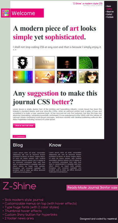


Description
Live preview: [link]
I'm allowing anyone to use this journal skin, but I'll like it more if you tell me that you're going to use it. Just so I know. (Smile)")
IMPORTANT EDIT: There is an improved version of this skin, you can find it over here: [link]
EDIT 3: Thanks so much for installing, commenting, and faving my first journal skin. I can't reply to everything though.
EDIT 2: Thirty favorites for my first skin?!?! You guys are insane! xD
EDIT: I think I forgot to mention that this skin comes with two custom cursors. (one as the "normal" cursor, and the other as a "link hover" cursor.)
Decided to post this as a journal skin.
I initially submitted this as a contest entry for *devCRIT's Journal CSS contest, but since I lost, I'm allowing anyone to use it.
This is one of my first attempts at CSS, so I'd appreciate any comments, suggestions, or critiques.
Many thanks to `Synfull for her CSS cursor tutorial which has showed me the proper code for adding a custom cursor to the CSS. (I have been using a general, improvised code which doesn't work here in deviantART.)
----------
HISTORY
0.1 : Changed title color to dark green and date and time placeholder color to light green, and removed footer.
0.0 : Initial release.
I'm allowing anyone to use this journal skin, but I'll like it more if you tell me that you're going to use it. Just so I know.
IMPORTANT EDIT: There is an improved version of this skin, you can find it over here: [link]
EDIT 3: Thanks so much for installing, commenting, and faving my first journal skin. I can't reply to everything though.
EDIT 2: Thirty favorites for my first skin?!?! You guys are insane! xD
EDIT: I think I forgot to mention that this skin comes with two custom cursors. (one as the "normal" cursor, and the other as a "link hover" cursor.)
Decided to post this as a journal skin.
I initially submitted this as a contest entry for *devCRIT's Journal CSS contest, but since I lost, I'm allowing anyone to use it.
This is one of my first attempts at CSS, so I'd appreciate any comments, suggestions, or critiques.
Many thanks to `Synfull for her CSS cursor tutorial which has showed me the proper code for adding a custom cursor to the CSS. (I have been using a general, improvised code which doesn't work here in deviantART.)
----------
HISTORY
0.1 : Changed title color to dark green and date and time placeholder color to light green, and removed footer.
0.0 : Initial release.
Comments461
Join the community to add your comment. Already a deviant? Log In
My first reaction is "this is cute and fun!"; it's a nice simple design with colors that really pop against the white. For a first attempt at CSS I'm impressed. The journal text is bright color pulled from the header image (always good to use colors from pics used in design) but not in-your-face as some of bolder colors (which really worked for the border and moods). It has a nice balance of warm and cool colors that are never too hot or cold.
I would suggest adding some padding to the left side of the moods or centering them. The green in the bottom links is a bit bright; the sea-foam or grassy green would have been a better choices given the background color. Also the text links in the content are a bit light. You want some more contrast between backgrounds and text colors for readability. The title and subtitle colors either need to be changed or centered (that green against the red has a strange effect).
Again, this is good start overall. I'll have to check out your gallery and see what other gems are hiding.